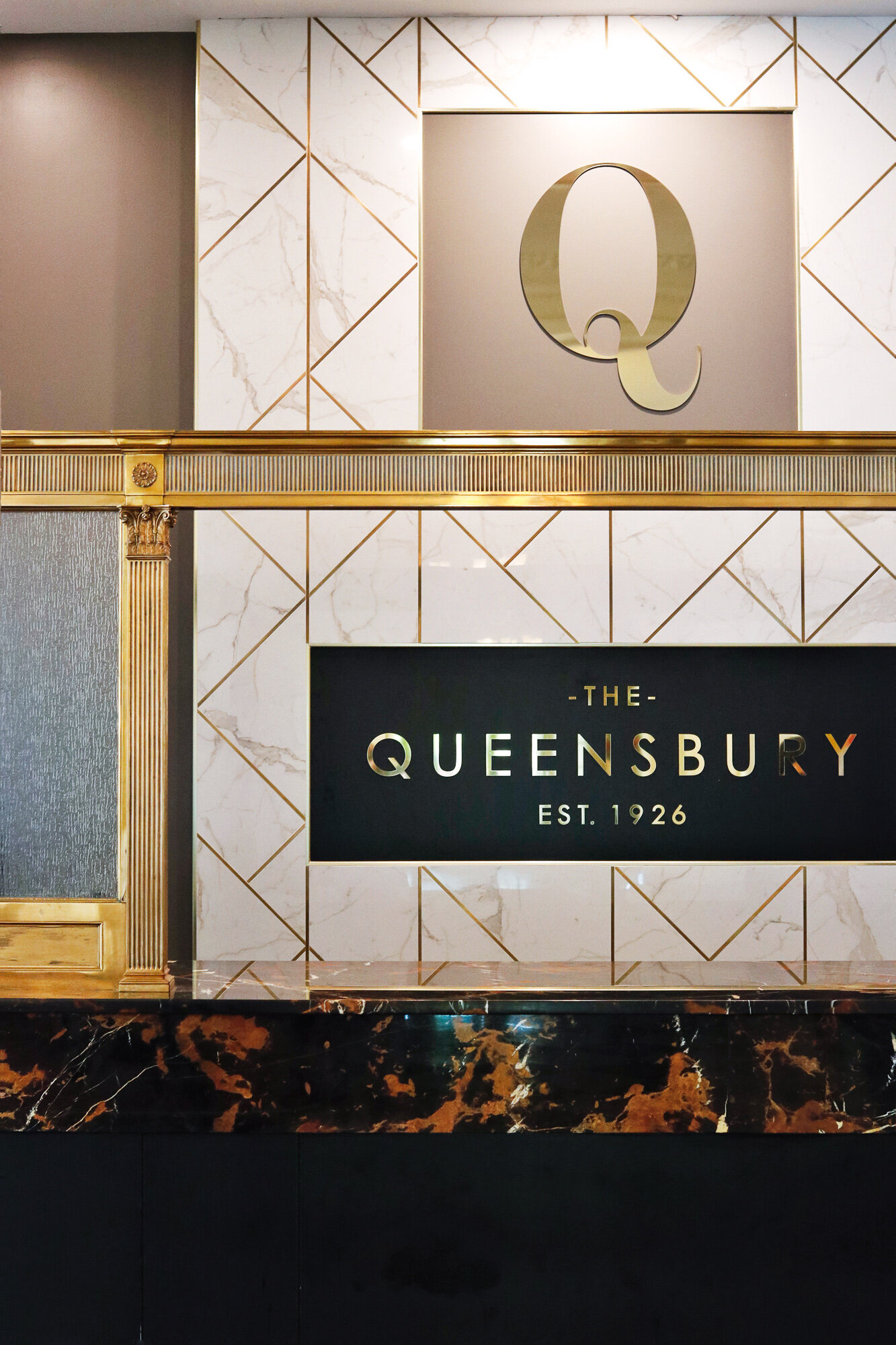
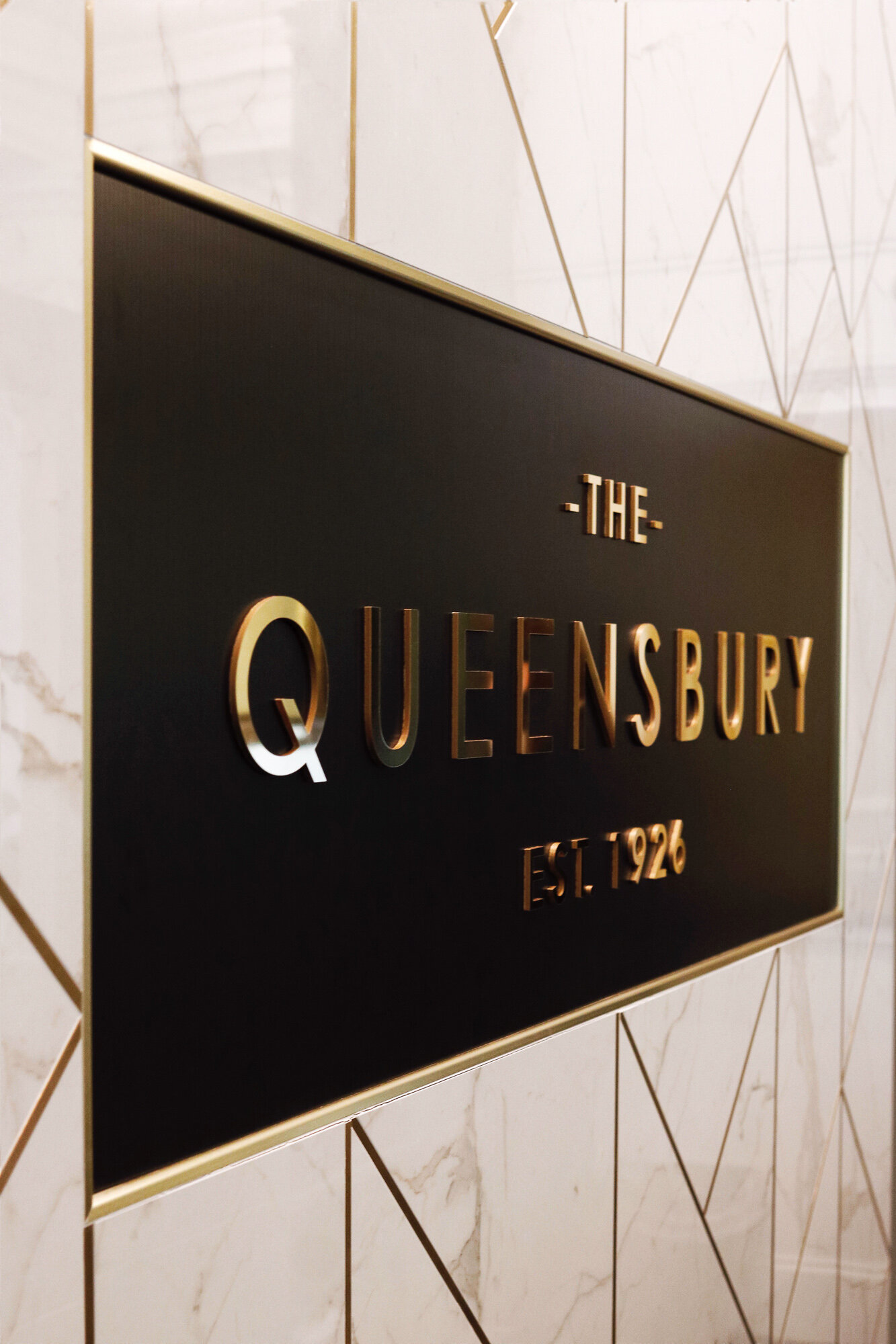
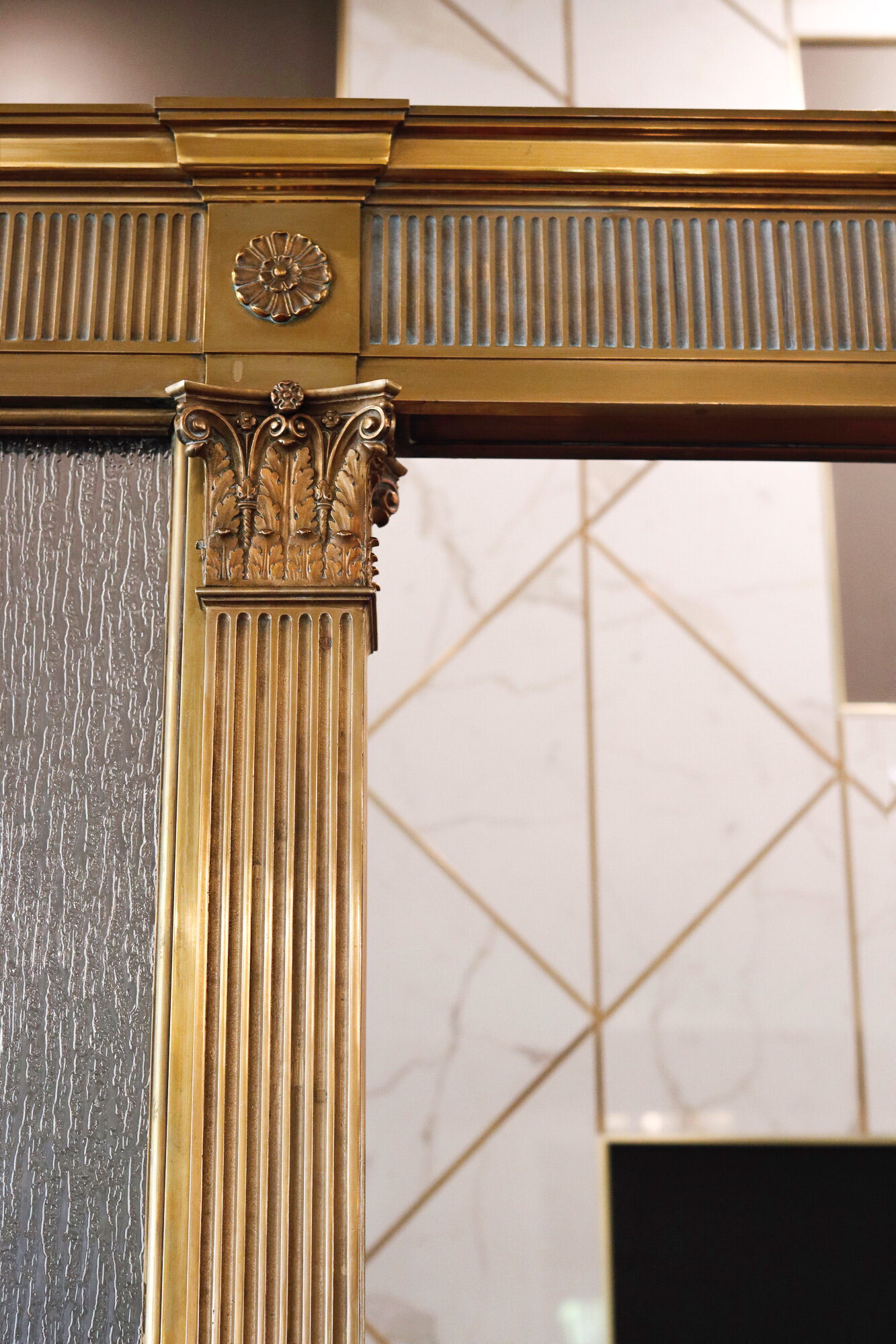
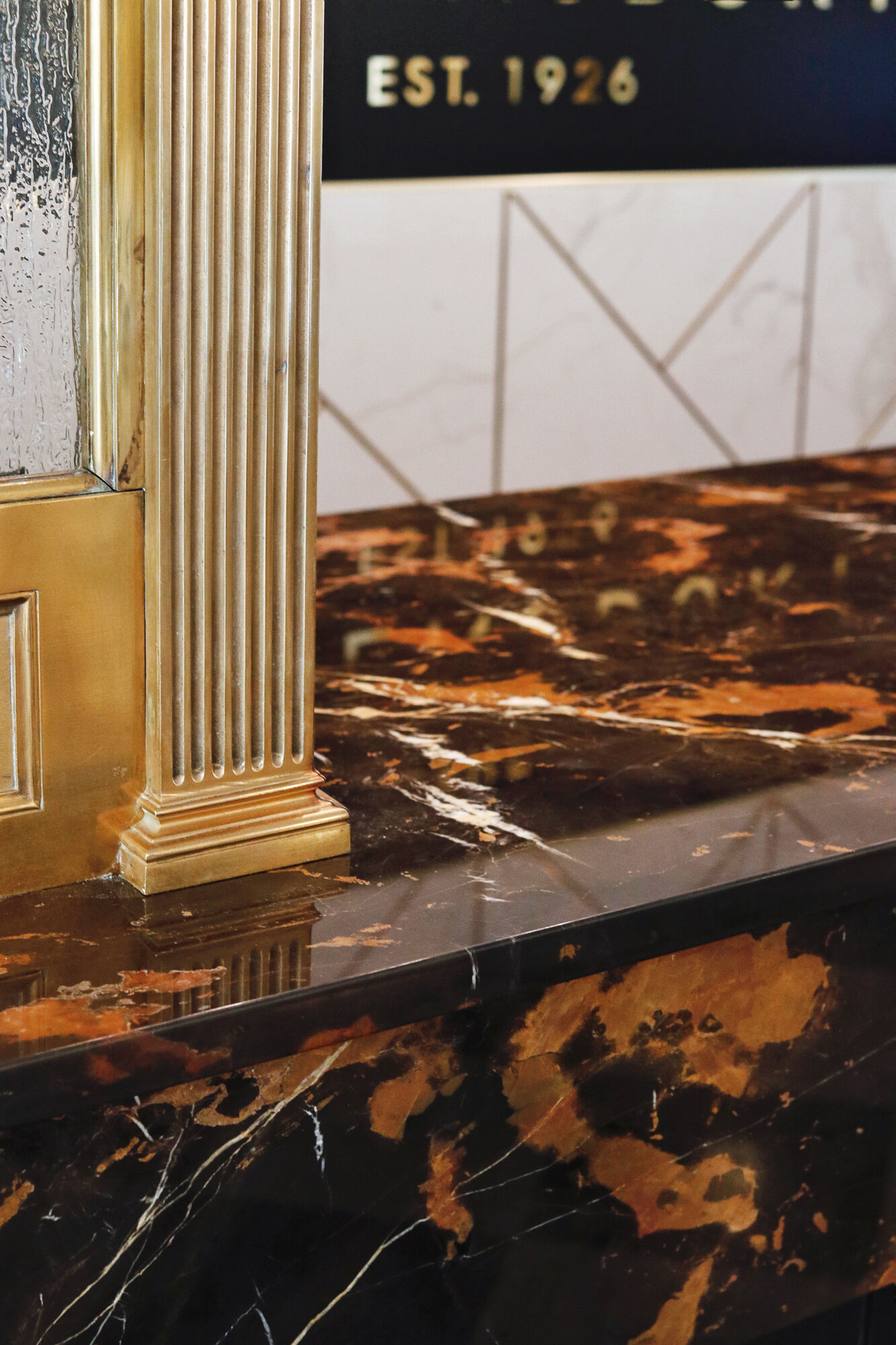
Checking in! The Queensbury Hotel recently updated their front desk, and we can’t get over the stunning transformation! From the brass accents, to the striking black pillars, to the gorgeous marble - the space has completely transformed to give guests and locals alike an amazing first impression. We stopped down to see it for ourselves and chat with general manager Tyler Herrick about the process - see it all below!
On the Past
Tell us about the history and evolution of the front desk - do you have any idea of what it was like when originally built?
We have some photos that show what the lobby and front desk looked like when the hotel first opened its doors in the 1920s. Originally, before the 1970’s expansion of the Adirondack Room and Pool area, the main entrance to the hotel was off Ridge Street so when you entered the hotel, the front desk was the centerpiece of the lobby and the first thing that greeted you.
The Queensbury Hotel Front Desk, circa 1930 • Photo provided by The Queensbury Hotel
The original front desk had a large marble countertop that was unfortunately damaged in the 1970s. Rather than replacing the marble, the ownership at that time placed a laminate countertop over the damaged marble. That laminate countertop was still there when we purchased The Q in 2016 and up until this renovation. Also, a lower ceiling and wall was added above the desk sometime in the 70’s and that was something we removed during this renovation to open up the space and make it feel more inviting to guests.
On the Renovation
What was your goal with this renovation?
Our goal for all of our renovation projects is to restore the property back to its 1920’s grandeur and elegance. And we think this restoration did just that. It brought back the historic pieces of the front desk by exposing the original brass work and matching the original marble to the best of our ability. In removing the additional walls, we were able to expose even more of the original columns and woodwork which got a fresh coat of black and gold paint to make them pop. The lobby was one of the first things we restored after purchased the hotel, and the front desk was always the last piece of the puzzle in that space that needed to be revitalized with some “wow factor”.
Whether a guest is staying overnight with us, attending a wedding or event or just having drinks in Fenimore’s Pub, the lobby is always a part of their experience in some way, shape or form. In a way, the front desk is a guest’s “first impression” and we all know how important first impressions are. We knew we needed to elevate the design of the front desk, while paying homage to the past, so guests are greeted with a warm welcome and historic hospitality.
Where did you draw inspiration from?
We have photos of what the front desk looked like in 1926 and tried to match it to the best of our ability, while incorporating some modern touches.
Tell us about the process!
We originally began the design process 8 months ago and for the most part, it was one of the easier projects we have done over the past few years. As always, we try to partner with as many local vendors and businesses as possible in our projects. We’re proud to have worked with Phinney Design Group (Saratoga Springs) on design work, Adirondack Precision Cut Stone (Queensbury) for the Marble, Bergman Custom Casework (Queensbury) for the front desk and storage cabinetry and West End Signs (Hudson Falls) for the custom lettering and signage.
Any surprises along the way?
One of the biggest obstacles we faced was trying to operate the hotel during the time of construction. We started demo back in April and the space was not usable again until June. We setup a temporary front desk station at the concierge desk in the lobby and luckily our staff is resilient, and our guests were understanding. We knew once the project was complete it would be well worth any temporary inconveniences.
What are some favorite details?
The brass plated “Q” and Queensbury Hotel lettering is definitely my favorite detail. It is now such a focal piece of the lobby. We are so proud of our name and our brand and the history that comes along with it. The addition of the “est. 1926” shows our guests our longevity and again promotes a feeling of elegance, history and luxury.
On the Future
What’s next - any plans in the works for additional renovations?
There are always updates and projects in the works here at The Q!
We have plans to build a small sundries shop right next to the front desk where guests can purchase some snacks, beverages, and essentials during their stay with us and possibly even local souvenirs and Queensbury Hotel logo items in the future. We also plan to update the carpeting in the Ballroom & Gold Room.
Then, our next big project will be the Adirondack Ballroom expansion. We have plans and renderings to take our current 2,200 square foot Adirondack Ballroom and enlarge it to 6,000+ square feet of event space that can accommodate events of 400+ people… stay tuned!


